Squeeze pages are a lot like blokes.
They can be very ugly but still have a lot of success 🙂
They can be good looking and appear to be successful but in reality don’t perform well.
They can be very small but still manage to…. – I think I’ll stop the analogy there.
Squeeze pages have become a BIG part of my business over the past few years.
Quite honestly it’s hard to fault the model.
You offer something of value for free and in return the visitor allows you to add her email address to your mailing list, and contact her about other offers you may have.
Once she’s opted in, you can present her with other offers and enticements in the form of One Time Offers, Upsells, Cross-sells etc
You know the score.
You’re probably even expecting a one time offer when you opt in for most marketer’s lists these days.
Nothing wrong in that.
I opt-in to lists every single DAY just to see how they do things behind the scenes. It’s fascinating and a constant source of ideas to pinch.
But there’s a right way and a wrong way to ‘do’ squeeze pages.
It took me a while to sort out what converts and what doesn’t.
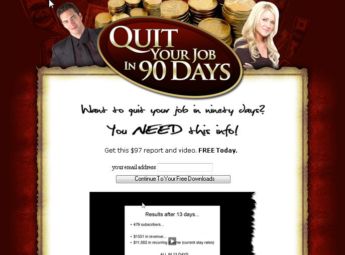
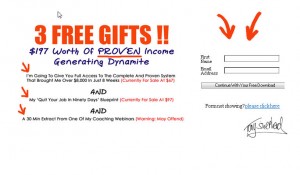
Here’s a quick test for you – which of these two squeeze pages converts best:
The bottom one does – the plainer one without the fancy graphics converts TWICE as well as the other one.
Tracking and testing.
And without doubt there’s an ART to building squeeze pages too.
It takes alot of time and effort and quite honestly it’s not as easy as it looks – lining up bullet points and knowing where to put the opt in forms, graphics and even video.
Recently I just grabbed myself a copy of a fabulous little product on squeeze pages.
To be honest I just got it for the templates that were included with the product – I KNOW 100% I can use these to boost my list size, and as the ‘entry point’ to the mini-funnels that are currently feathering my nest.
But I’m writing this blog post to recommend it to you because if you’re not having much success with your squeeze pages or the whole thing is making your head hurt, then do yourself a favour and cut save yourself a LOT of time by investing in the following product right now.
It’s priced at $97 but if you use TONY’S DISCOUNT LINK you’ll be able to get your copy for $47, at least for the time being.
There are videos and tutorials in abundance, including one that caught my eye – an autoresponder tutorial that goes through the whole buyer/prospect seperation thing, which MOST people, including many big marketers get badly wrong.
The reason I got this product though, was that I think the quality of squeeze page templates (they work with copy, video and images) are just excellent.
You just plug ’em in, make a few tweaks and that’s it.
The girls (Sonia and Angela Panesar) who have just released this have tested the pages and they say they’re proven to convert.
I personally know how much it matters to have high converting squeeze pages, and I know that I couldn’t get these templates made for under $400 from a professional webbie, so getting them for just $47 HERE along with a full course on how to profit from squeeze pages isn’t something I was going to miss.
Grab your copy and start REALLY using squeeze pages in your business.
Get my blog posts delivered by Email


Excellent post as always, what ever mood I’m in it always cheers me up and sets me on my way to working harder again. Thank you for that.
I agree totally with the analogy to blokes too. The slick ones are just that, no substance at all, just pretty and boring. Air heads and self obsessed. Give me a grafter any day of the week!
Go safe, Pol
Tony,
I think you are correct. The minisite with all the fancy graphics is beginning to fade away as far as opt in pages. It seems that just a good headline, a few bullet points with benefits and the opt in form converts at a higher rate than the graphics.
Will have to check out the resource. Thanks for that!
Ron
Thanks for the suggestion, Tony! I’m going to check this out.
Yeup Tony,
I think people have been stung by the wow too many times and associate fancy graphics with empty wow.
But then you get Paul Coleman who is marketing a product encourageing you to increase the drama of your graphics…go figure…
Thanks for another piece of useful info Tony.
Not heard from sara for a while, is she OK?
regards Andy
Thanks, Tony – interesting post, as usual.
Squeeze pages are unruly creatures! I mean, you never know whether they’re going to convert or not. The same with graphics. One thing that definately sends me running in almost every case, are squeeze pages and sales lettters with fancy cars or car/mansion shots! I’d never use them myself, and when I find them elsewhere, my browser window usually closer in a tenth of a second. 🙂
Bye now,
Laurie
cooooooooooooooooooooooooooool
Hi Tony
You’ve definitely given me food for thought. I’ve been offered some fancy graphic squeeze pages (luckily didn’t pay for them), but now I’m wondering whether not to bother with them and consider using something plainer!
Also a useful tip about opting-in to other people’s lists for ideas.
Cheers
Dave
Hey Tony
I Love the post. Its amazing that the plainer one converts better. I did a similar test and found the same.
Thanks for all the information.
Cheers Kerie 🙂
Hi Tony,
I just discovered your blog and it’s loaded with great and valuable information, definitely worth it coming back more often.
Thank you.
Have a blessed journey,
Alex Rivera